Website Design: Dive The Blues
I’ve been radio silent for the last three weeks… but that’s not to say that I’ve taken a break from my computer. Quite the opposite actually. In fact, I’ve been so stuck to this computer that I’ve literally been dreaming in WordPress & html code. Literally…
With as much time as I have had to spend with my foot propped up over the last few months, I decided that it was time to start learning some new skills. I love blogging and design and I have always been interested in website design, but it’s not something that I have ever really pursued. Until now.
Our dive instructor teaches both scuba diving and sky diving, so when he opened his own company, he named it Dive the Blues. He’s a popular teacher out here and people ask him for his website all the time. The problem is… he hasn’t had one. Also- until now. So two weeks ago we started talking about what he wanted in a site. It turned out to be a much bigger project than I expected, (a reoccurring theme with my projects).
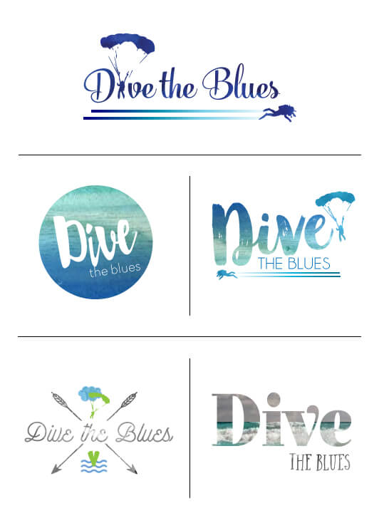
I started with logos. He wanted to combine both a scuba diver and a sky diver in the logo, or otherwise incorporate both the sea and the sky. Here are a few of the logo concepts I came up with.
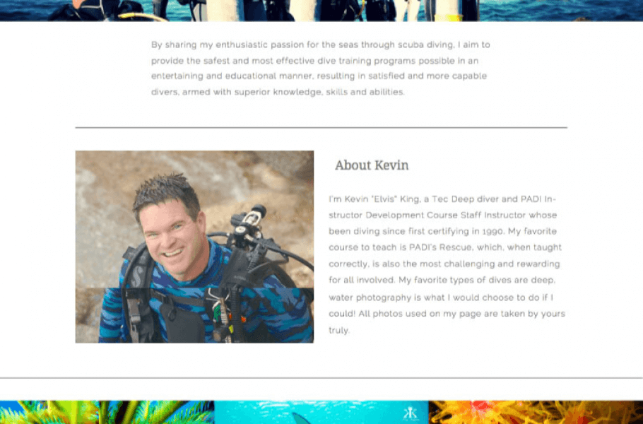
He decided to go with the logo on the top. Once that was decided, it was off to the computer to design the site. I’m pretty pleased with how it came out. I added screen shots below, but to get a better feel for the site, check it out for yourself! www.divetheblues.com
One of my favorite features were these cute little icons I designed for the home page. There is nothing like shape building with illustrator :)
So without further ado, here’s my first website:
Each of the 17 dive specialties has its own page, which looks like this:
Sky diving page has less detail, as classes are not being offered while in Okinawa:
The whole site wraps up with a contact page. Other features include a calendar & events page and a recommendation section.
Looking for a new website? Let me know! It’s still going to be another 8 weeks till I’m out and about running around Okinawa.
Check out my second website design here!
Leave a Comment cancel
MOST RECENT IN "TRAVEL"
VIEW ALLMOST RECENT IN "PROJECTS"
VIEW ALLMeet Mindy
In 2013, I quit my job and bought a one-way ticket to Thailand. After four months of backpacking I returned to the States and fell in love with a guy whose job sent us straight back to Asia. Nothing has gone according to plan... and it's been absolutely magical.
Read more
Search WTW
Archives
Copyright © Walking Through Wonderland 2012 - 2026. All rights reserved.







Pingback: Website Design: SholineAccess | Walking Through Wonderland
How awesome Mindy!! I love those little illustrations you designed!
I’ve always wanted to learn website design as well.. well mostly for personal reasons! I guess something good came out of your foot injury, lol!
That’s awesome! And well done! Coding and getting a good looking website up is definitely nothing to sneeze at!
you are so talented! love how it all turned out
The logo is fantastic! Great Job! I have always enjoyed your work. Keep at it. I hope all is well!
Thank you so much!! So great to hear from you!
Looks awesome!!! I love the icons and the paralax feature on the main page!! <3 <3 <3
Thanks!! That’s one of my favorite parts too!